CSG Telecom SaaS Concept - Management Platform for Operators
This project is a product design concept developed for CSG: a SaaS management platform designed to be applied to telecom operators. Built for the back office, it lets internal teams manage subscribers, track network usage and billing, and connect the system to external CRM, support and artificial intelligence tools. The challenge was to design a data-dense management tool without it becoming confusing or intimidating for the people who use it every day. The interface is built around a generic brand, ready to be adapted to each operator.
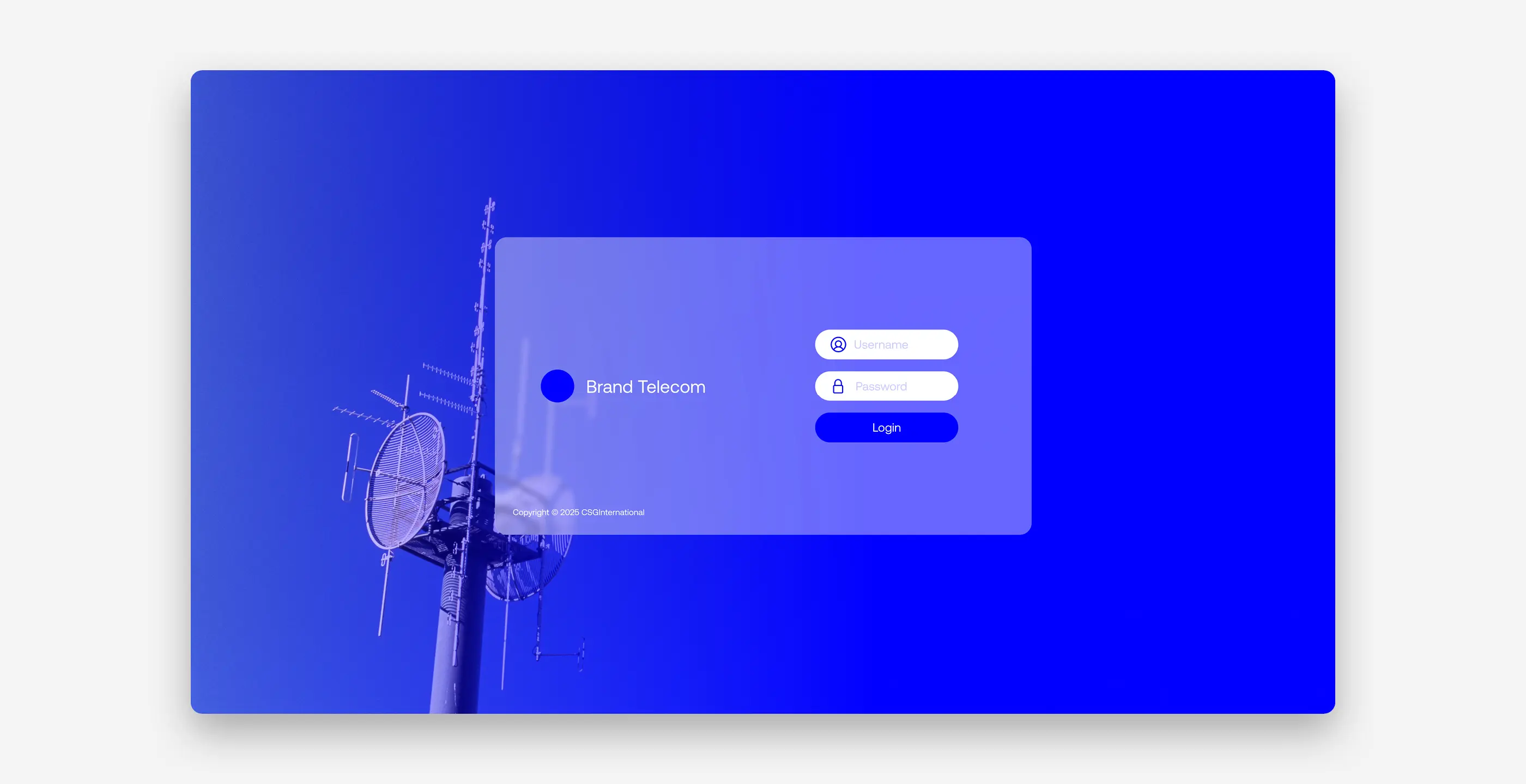
The entry point is a login screen that immediately anchors the product in its industry: a photograph of a telecom antenna, treated in blue duotone, layered over a simple access form. It is a deliberate decision. Before any data or chart appears, the user already senses they are entering a telecom system and not a generic SaaS tool.
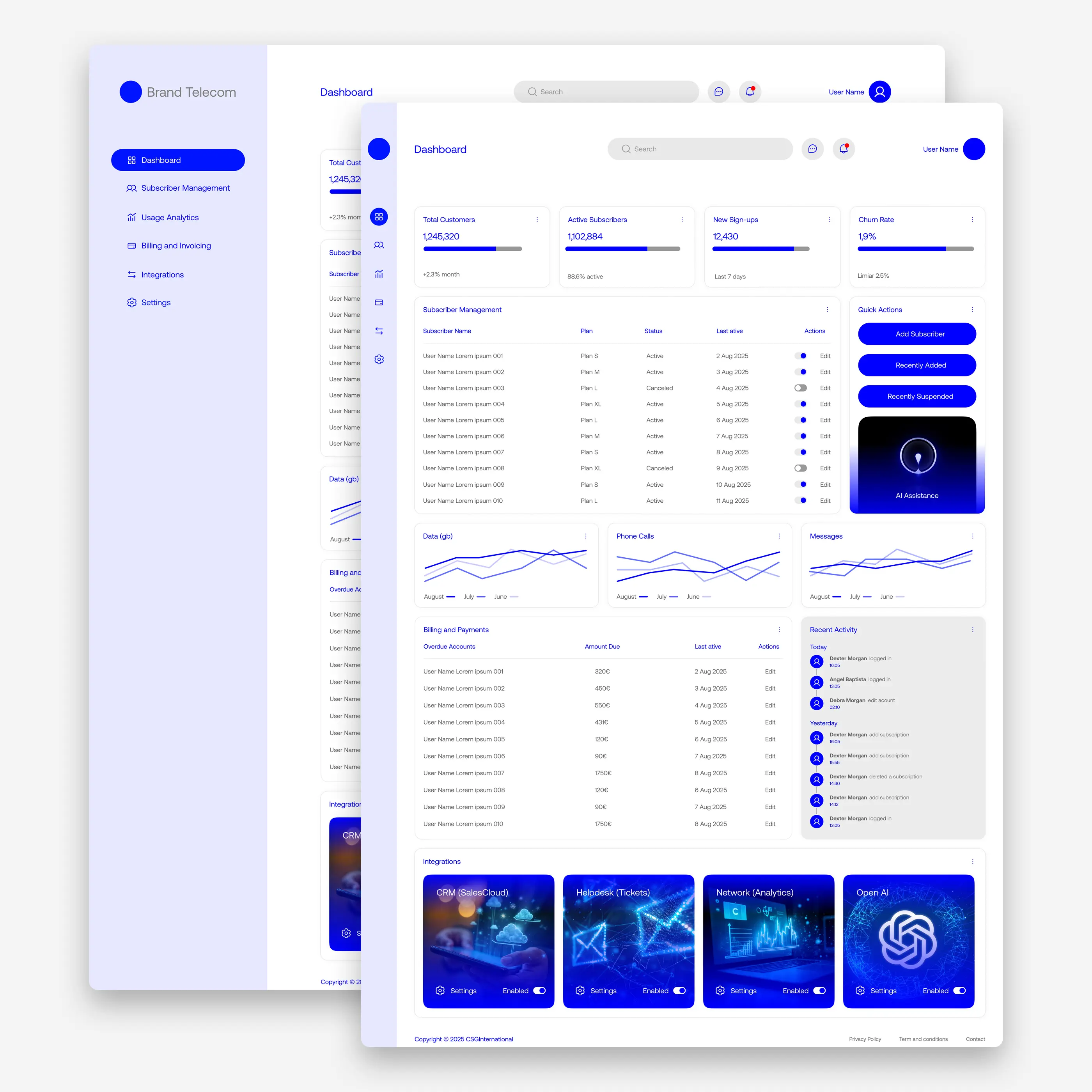
The main Dashboard works as an overview of the entire business. Indicators such as total customers, active subscribers, new sign-ups and churn rate appear in cards with progress bars, followed by a subscriber management table, comparative usage charts (data, calls, messages) and a billing summary with overdue accounts. One intentional standout is the "AI Assistance" card, treated in a visually distinct way, with a dark background and a glow effect, to clearly separate the operational features from the artificial intelligence assistant. This suggests that AI is an added layer and not just another module among many.
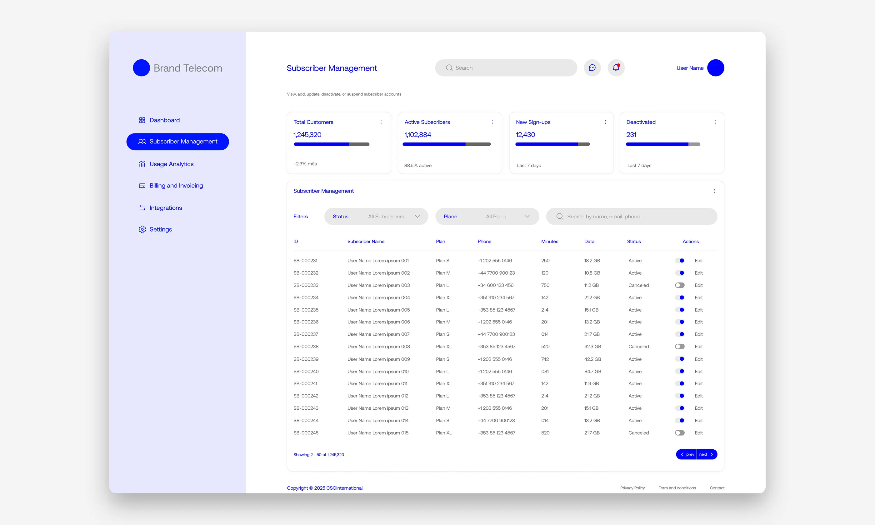
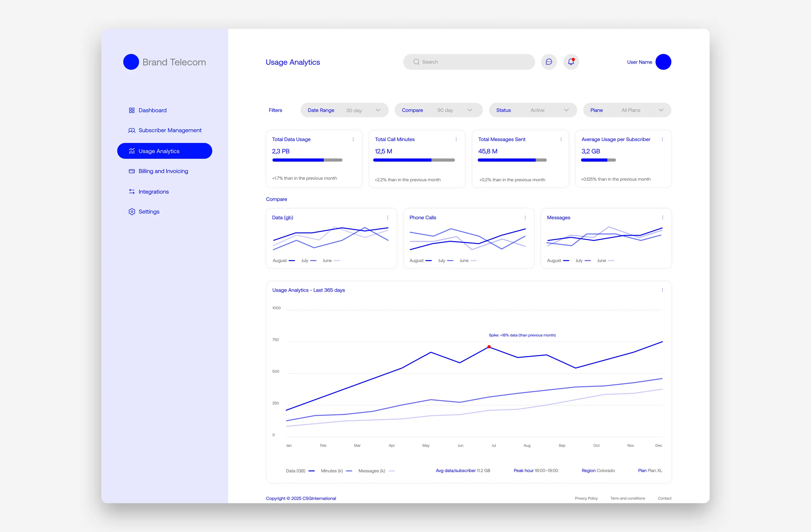
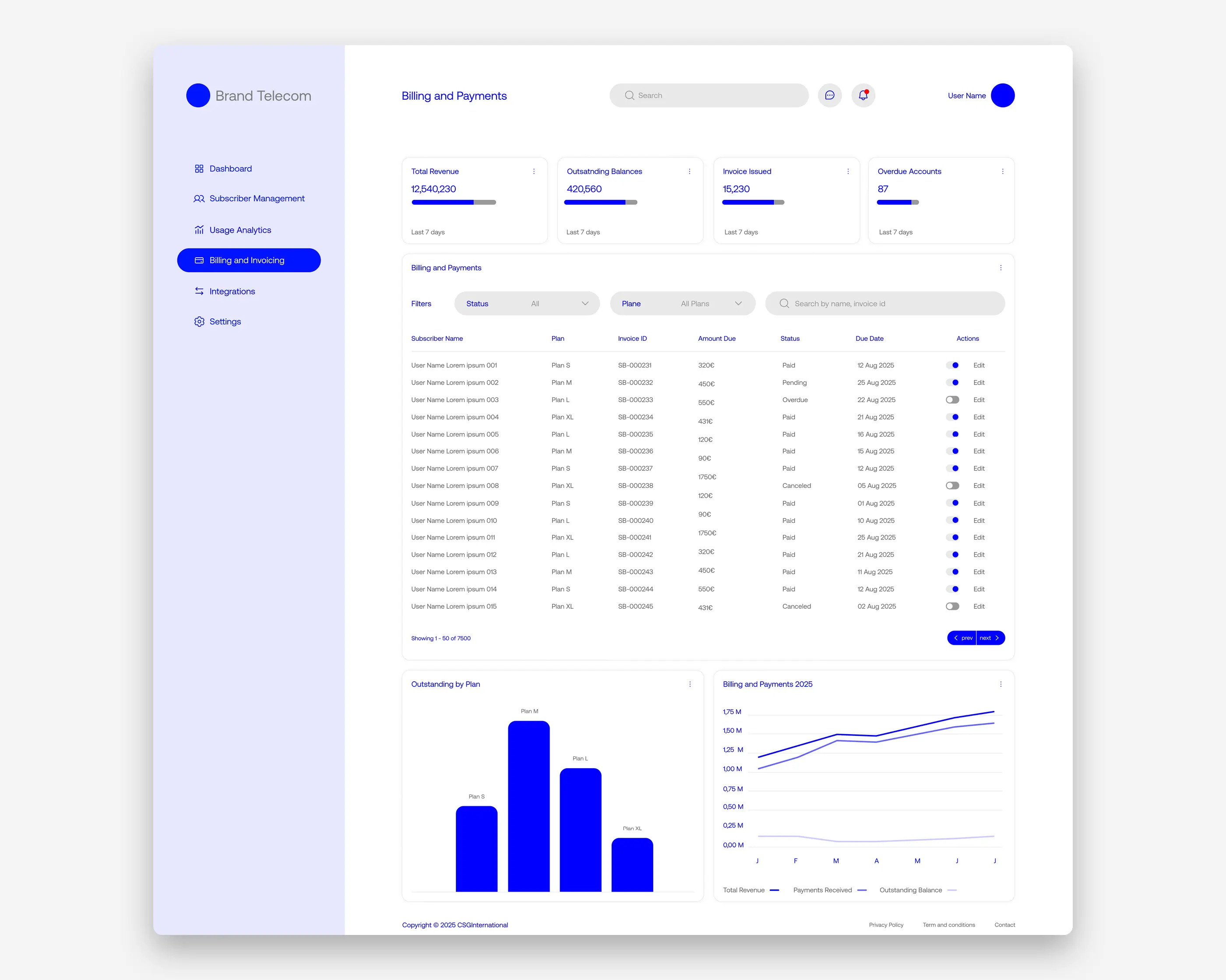
The detail pages follow the same visual hierarchy as the home page. Subscriber Management offers an extensive, filterable table with each account's identification, plan, contact, usage and status. The Usage Analytics page isolates network metrics (data, minutes, messages), with period and comparison filters, and culminates in a yearly chart that automatically flags relevant usage spikes. The Billing and Payments page mirrors the same structure on the financial side, with total revenue, outstanding balances and overdue invoices, complemented by breakdown charts by plan.
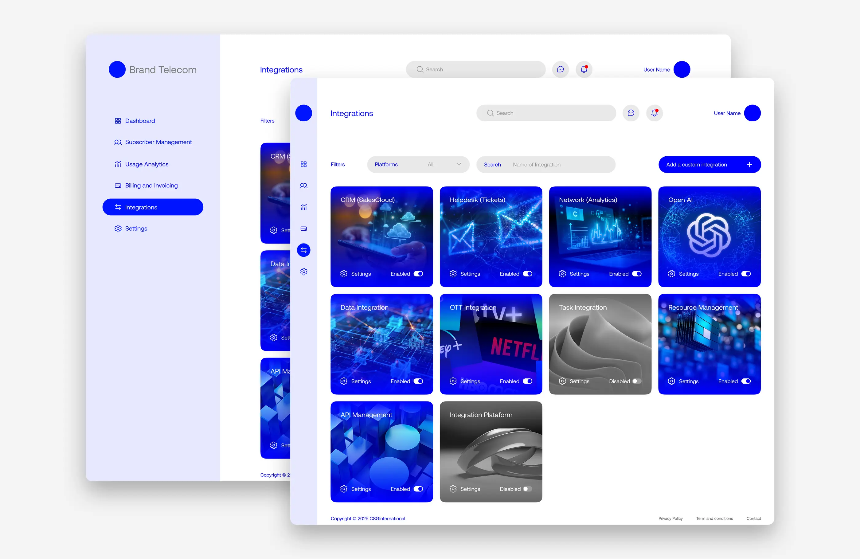
The Integrations page is where the concept gets more interesting. Instead of a technical list of connectors, each integration (CRM, helpdesk, network analytics, OpenAI, API management, or even OTT partnerships such as Netflix) is presented as a visual card with its own imagery, summarizing in an almost editorial way the role of each tool in an operator's ecosystem.
Taken as a whole, the project explores how to impose visual order on a product that, by nature, deals with enormous volumes of operational data (subscribers, usage, billing), without losing the quick readability that an operations team needs when opening the system every day. The consistent blue palette, the modular cards and the repetition of patterns across pages (indicators at the top, a table in the center, supporting charts) create a coherent visual system that adapts to different types of content without forcing the user to relearn the interface in every section.
The logotype follows an equally rigorous logic. The letters of "SINTER" were drawn on an explicit modular grid, with a constant monolinear stroke and rounded terminals, the same formal vocabulary as the symbol's capsules, now extended into typography. The result is a geometric, technical wordmark, with a deliberately angular, unconventional "E" and "R" that reinforce the industrial character without falling into the visual clichés of the metalworking sector.
In its final application, the red symbol and the gray wordmark work as a two-piece system that can shift between full-color, grayscale or fully monochrome versions, always preserving the legibility of the symbol's core form, the true point of identity for the brand.
Taken as a whole, the Sinter project shows how an industrial process, and a consortium of companies built around it, can be translated into a single, coherent visual system. It does so without resorting to literal metaphors of metal, heat or machinery, finding instead its own language in the behavior of the particles that give the technique, and the brand, their name.
Social
© 2005 – 2026 Ricardo Silva
© 2005 – 2026 Ricardo Silva